
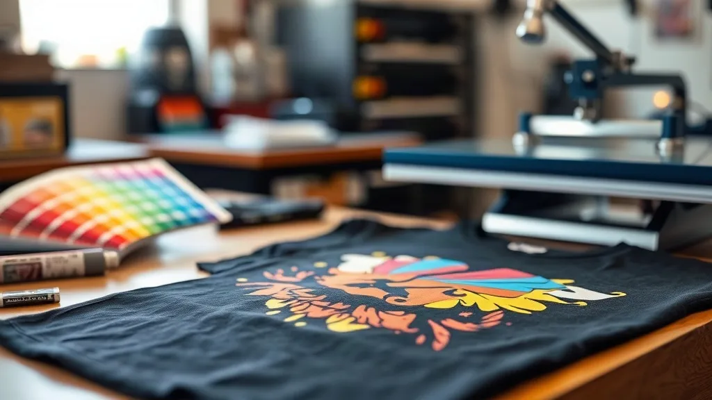
You send a job that looked electric on your monitor, then the client holds up a hoodie and says, "this red looks pink." That moment is where repeat business either grows or quietly dies. Color accuracy is the quiet dealbreaker in dtf transfers, and getting it right is less about expensive gear and more about discipline. This guide walks through the exact habits I use to keep colors predictable, from file prep to the first wash.
Why Color Drift Happens in DTF Work
Every dtf print passes through at least four color handoffs: the design file, the monitor, the printer's RIP software, and the powder-and-press stage. Each handoff can shift hues. A file built in RGB gets converted to CMYK for printing, and that conversion is where most surprises live. Add in the glow of a backlit screen, and a color that looks punchy in Photoshop can flatten on a stretchy cotton blend.
The press stage adds another variable. Heat, pressure, and time affect how the ink film bonds and how bright the color reads. A transfer pressed too hot can dull saturated hues or create a slight sheen that changes perceived color. So color accuracy isn't a single setting. It is a chain, and the weakest link sets the outcome.
Start With the File, Not the Printer
Before you touch the press, fix the source. Most color complaints trace back to files that were never prepared for print.
Lock in the right color mode
Work in RGB for digital design but convert to CMYK using the profile that matches your printer and ink set. Do not let the RIP guess. If you offer clients a template, build it in the correct mode from the start so their submitted art arrives closer to print-ready.
Use spot references for brand colors
When a client sends a brand color like a specific Pantone, do not eyeball it. Ask for the code, then sample it in your design software and compare against a physical swatch. For logos and corporate orders, print a small test patch of the exact color before running the full gangsheet. This one habit has saved me more reprints than any software upgrade.
Watch out for gradients and thin lines
Fine gradients and hairline strokes are where dtf transfers tend to struggle. The ink layer is thin, and subtle transitions can band under the press. If a design relies on a smooth fade, build in a little contrast so the gradient holds after transfer.
Build a Printer Profile You Trust
Your printer needs a color profile that reflects how it actually lays down ink on your specific film and powder. A generic profile is a starting point, not a finish line.
- Print a standard color target on the film and powder system you use.
- Press it onto the exact fabric you plan to sell, then let it cool fully.
- Measure the result with a spectrophotometer if you have one, or compare visually against a physical swatch under neutral lighting.
- Adjust the profile in your RIP software and repeat until the patches match your targets.
Do this once per fabric family. Cotton, polyester, and blends absorb and reflect color differently, and a profile tuned for a heavyweight cotton tee will not read the same on a poly performance shirt. Keep separate profiles and label them clearly so your team reaches for the right one.
Dial In the RIP Settings That Move Color
RIP software is where most day-to-day color control lives. A few settings matter more than the rest.
- Ink limits: Too much ink creates pooling and muddy color. Too little leaves prints washed out. Find the ceiling that keeps saturation without bleeding.
- Halftone and resolution: Higher resolution helps fine detail, but extremely high settings can slow output without visible gain. Match resolution to the design and fabric.
- White ink laydown: On dark garments, the white underbase determines how bright the top colors read. Too thin and colors turn ashy. Too thick and the print feels stiff. Tune it per fabric weight.
- Color management on or off: If you let the RIP manage color, keep it consistent. Mixed settings across jobs are a common source of drift.
Save these as presets for each fabric and design type. Consistency beats perfection, because a predictable result lets you promise the same look on every reorder.
Test on the Fabric You Actually Sell
This is the step most shops skip, and it costs them. A transfer that looks flawless on a white cotton tee can shift dramatically on a heather grey blend or a dark poly hoodie. Always press a test piece on the real substrate before a bulk run.
Pay attention to fabric color bleed, especially on darker or dyed garments. Some dyes migrate into the transfer film under heat, dulling the print over time. If you sell heavily dyed blanks, run a wash test to confirm the color holds. For more on choosing the right blanks, see our guide to podmethods.com resources on garment selection.
Wash Testing: The Real Proof of Color
Color accuracy on day one means little if the print fades after three washes. Build a simple wash test into your quality routine.
- Press a sample with your standard settings.
- Wash it inside out in cold water with a mild detergent.
- Tumble dry low or hang dry, then compare against the original swatch.
- Repeat for at least five cycles and note any shifts in brightness or hue.
If a color fades faster than expected, the issue is usually insufficient press time or temperature, or a powder that did not fully cure. It is rarely the ink itself. Fix the press settings and retest before blaming the film.
Set Client Expectations Up Front
Half of color complaints are really expectation problems. Clients see colors on phones with wildly different screens. A short note in your order form explaining that screen colors vary and that you match to physical swatches prevents most disputes. Offer a physical proof for large or brand-critical orders, and price it into the job.
When a client insists on a precise brand color, quote a test patch as part of the order. It protects both sides and builds trust. Shops that communicate this clearly get fewer angry emails and more repeat dtf orders.
Common Color Accuracy Mistakes to Avoid
- Trusting a monitor without a physical swatch check.
- Using one profile for every fabric weight and blend.
- Skipping the white underbase test on dark garments.
- Changing RIP presets between jobs and losing consistency.
- Shipping bulk orders without a wash test on the real blank.
FAQ
How do I stop colors from looking dull after pressing DTF transfers?
Dull results usually come from a thin white underbase on dark garments or from pressing too hot. Increase the white laydown slightly, verify your press temperature against the film manufacturer's spec, and test on the actual fabric before a bulk run.
Can I match a client's exact Pantone color with DTF printing?
You can get very close, but exact Pantone matching is not guaranteed because DTF uses CMYK ink plus white. Ask for the code, print a physical test patch on the real garment, and confirm with the client before production.
Why does the same design look different on cotton versus polyester?
Fabric absorbency and reflectivity change how ink reads. Polyester tends to shift colors slightly and can show dye migration on dark shades. Keep separate printer profiles for each fabric family and always test on the exact blank you sell.
How many washes should a quality DTF print survive?
A well-pressed transfer on a compatible fabric typically holds color and adhesion through dozens of washes when cared for properly. Wash inside out in cold water and avoid high heat in the dryer to extend print life.
Do I need a spectrophotometer to get accurate DTF color?
Not necessarily. A spectrophotometer speeds up profiling and adds precision, but a disciplined workflow with physical swatches, neutral lighting, and consistent RIP presets gets most small shops very close to accurate color.