
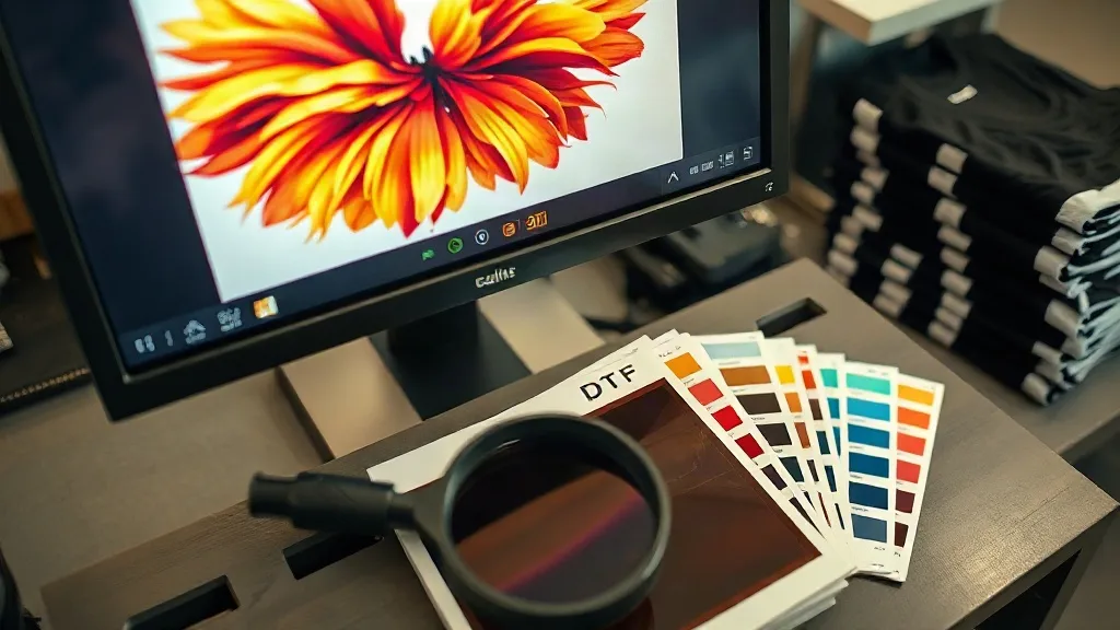
Most print shops that struggle with dtf transfers blame the press, the powder, or the film. In my experience running short-run apparel jobs, the real culprit is almost always upstream: a file that was never built for the process, or a color expectation that nobody checked before the sheet went through the printer. Getting color and prepress right is the cheapest quality upgrade available to any dtf operation, and it costs nothing but discipline.
This guide walks through the prepress decisions that decide whether a transfer looks crisp and true or muddy and off-brand. No theory dumps. Just the steps I go through on every job, plus the mistakes that still catch me out after years of pressing.
Why DTF Color Behaves Differently From Screen or DTG
A dtf print is not printed onto the garment. It is printed onto a film, dusted with adhesive powder, cured, and then heat-pressed onto fabric. That extra material stack changes how ink reads. White ink sits underneath everything as an opaque base, colors are printed on top in reverse order, and the final result is viewed through a thin adhesive layer bonded to textile.
The practical consequence: what you see on screen, and even what you see on the printed film, is not exactly what lands on the shirt. Dark garments compress perceived contrast because the white base reflects light differently than a paper substrate. Light garments let a little of the shirt color bleed through very thin ink areas. If you calibrate your expectations to the film alone, you will be surprised at press time.
The white base is doing more work than you think
On a black tee, that white layer is effectively your canvas. If it is uneven, starved, or over-inked, every color above it inherits the flaw. A common symptom is a color that looks correct in isolation but goes gray or dull on the garment. Nine times out of ten, the white base was too thin in that area, not the color channel.
Film color is a preview, not a proof
Treat the printed film as a rough check for registration and missing elements, not as a color proof. The only reliable proof is a pressed sample on the actual blank you plan to use. Build that into your workflow for any new design or new garment, and you will stop shipping surprises.
File Setup Rules That Prevent Most Reprints
Before a file touches your RIP, it should pass a short checklist. These are the habits that separate shops with low reprint rates from shops that are constantly re-pressing.
- Work at final print size. Scale the design in your layout software, not in the RIP, so stroke weights and small text stay predictable.
- Use vector where possible. Logos, type, and line art should be vector or exported at 300 DPI at final size. Upscaling a 72 DPI web logo is the single most common cause of fuzzy edges.
- Set a transparent background. Export PNG or TIFF with alpha, not a white box. A flattened white background will print as a white rectangle behind your art.
- Respect a minimum feature size. Very fine lines and tiny serif text can fill in or break up. Nudge small type up a point or two rather than hoping the press holds it.
- Flatten effects carefully. Drop shadows, glows, and transparency blends can render unpredictably. Rasterize them at final resolution before export.
- Convert spot colors to process. Your film printer does not know what Pantone 485 is. It knows CMYK values. Convert deliberately and note the target values.
One more habit worth building: name files with the job number, design name, and size. When a client asks for a reorder eight months later, you will thank yourself.
Building a Color Workflow You Can Trust
Color management sounds intimidating, but for a small dtf shop it comes down to a few controlled steps. You are not chasing perfect scientific accuracy. You are chasing repeatability, so that job five looks like job one.
Start with a calibrated display
If your monitor is uncalibrated, every color decision you make is a guess. A basic hardware calibrator costs less than a single ruined bulk order and takes twenty minutes to run. Set brightness to a comfortable working level, usually around 120 candelas, and recalibrate monthly.
Use the right ICC profile in your RIP
Your RIP software should be using a profile built for your specific printer, ink set, and film. Generic profiles get you close, but a custom profile made from printed and measured targets will tighten color considerably. Many ink and film suppliers will build one for you if you send printed swatches. Ask before you assume.
Control total ink limits
Over-inking is the quiet killer of dtf quality. Too much ink causes bleeding at edges, poor powder adhesion, and a plasticky hand feel. Watch for color patches where total coverage exceeds what your film can absorb. If heavy builds look wet or glossy on the film, back off the ink limit and re-test.
Proof on the real garment
Press a sample onto the actual blank. Not a similar shirt. The actual one. Fabric composition, weave, and color all shift how the transfer reads. Keep a labeled sample library of your top five blanks with a standard color test print on each. When a client questions color, you have a physical reference instead of an argument.
The Prepress Checks I Run Before Every Job
This is the routine I follow, in order, before sending a sheet to print. It takes a few minutes and has saved me far more time than it costs.
- Open the file at 100 percent. Zoom in on small text and thin lines. If edges look soft on screen at final size, they will look soft on fabric.
- Check dimensions against the garment. A design that fits a youth medium will look lost on an adult 3XL. Confirm placement dimensions, not just artwork size.
- Verify the color mode and profile. Confirm CMYK or RGB per your RIP's expectation, and confirm the correct profile is applied to the job, not leftover from the last file.
- Do a soft proof. Toggle the profile preview in your RIP and look for out-of-gamut warnings on saturated colors. Decide now whether to adjust or accept the shift.
- Check the white layer separately. Confirm the white base is present, correctly sized, and not bleeding beyond the color layer unless you intentionally want a halo.
- Print a small test strip. For new designs or new blanks, print one copy, press it, and inspect before committing the full sheet.
Skipping step six is where most waste happens. A single test press costs pennies compared to a gangsheet of reprints.
Common Color Problems and What Actually Fixes Them
When a print comes off wrong, resist the urge to change three settings at once. Change one variable, re-test, and record what happened. Here are the fixes that work for the issues I see most.
- Colors look washed out on dark shirts. The white base is too thin or uneven. Increase white coverage and check for missing white under mid-tone areas.
- Colors look too dark or muddy. Total ink is too high, or the profile is over-inking. Reduce ink limit and re-proof.
- Reds and oranges shift toward brown. Likely an out-of-gamut issue. Adjust the source color toward a printable value or accept a controlled shift and note it for the client.
- Edges bleed or feather. Film is absorbing too much ink, or the print head is too close. Check film type and head height.
- Color looks right on film, wrong on garment. Almost always a white base or fabric interaction. Press a proof on the real blank before assuming the file is wrong.
Keep a simple log. Date, job, change made, result. After a few months you will have a troubleshooting reference tailored to your own equipment, which is worth more than any generic guide.
Frequently Asked Questions
Do I need a custom ICC profile for my DTF printer?
Not strictly, but it is the fastest way to repeatable color. Generic profiles get you in the ballpark. A custom profile built from measured targets on your own printer, ink, and film will noticeably tighten consistency, especially across long runs and reorders.
Why do my colors look different on film versus on the shirt?
Because the film is not the final substrate. The adhesive layer, the white base, and the garment fabric all affect how light reflects back to the eye. Always proof on the actual blank rather than judging from the film.
What resolution should I use for DTF artwork?
Target 300 DPI at final print size for raster elements. Vector art is preferable for logos and type. Avoid upscaling low-resolution web images, since the softening shows up clearly on fabric.
How do I stop small text from filling in?
Increase the point size slightly, avoid very thin serif fonts at small sizes, and confirm the file is at final dimensions before export. If text is still closing up, check ink limits and head height on the printer.
Can I match Pantone colors exactly with DTF?
Not exactly. DTF uses process inks, so some spot colors fall outside the printable gamut. You can get close with careful profile work and controlled adjustments, but plan for a small, documented shift on highly saturated colors and set that expectation with clients early.